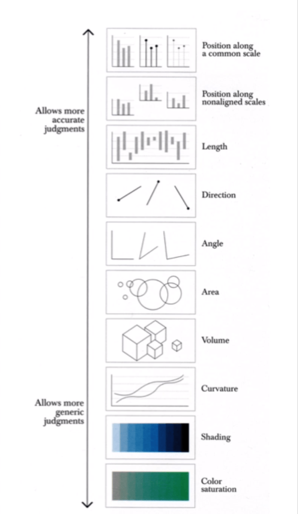
Visualising Data: Week 5

Lecture Notes

Data Presentation Styles: Why use Graphs?

  • Why do we use graphs?
    • Graphs help to make comparisons easier.
  • Often designers choose a style of graph that is trendy, rather than the graph best suited to the data you’re trying to present.
  • The human brain gravitates towards comparing the width or height of shapes in graphs, and its usually easy to underestimate the difference in surface area when looking at a bubble chart for instance. Bar graphs are much easier to draw comparisons from because we only have to consider the length as a variable. Consider which graph type is easiest to analyse and compare differences with.
  • Using circles in graphs always leads the audience to underestimate the size difference.
Cairo, A. (2013). The Functional Art. Berkeley, California: New Riders.
  • Three graph types commonly used
    • Time series chart (data over time)
    • Bar chart (one variable)
    • Scatter plot (one variable on each axis)
    • Pie chart (comparing proportions)

Visualising Data: Week 4

Lecture Notes

Historical and Contemporary Visualisation (Part 2)

Why do we visualise?

  • To help us gain an insight and understanding into complex issues.
  • When faced with a large amount of data, it is hard for us to draw comparisons between conclusions. In the form of a graph, it is much easier to draw comparisons in a visual form. Therefore creating visualisations saves the audience time and effort trying to draw comparisons by creating comparisons for them.
  • The main goal of any graphic and visualisation is to be a tool for your eyes and brain to perceive what lies beyond their natural reach.
  • Rather than showing all the information available in a graph, it may be more useful to only show important information, to help the audience distinguish information.
  • Sometimes it is up to the designer to choose which information to show and what to hide, rather than leaving it all up to the computer. Designers can choose what information is useful and what just makes the graph confusing and cluttered.

Visualising Data: Week 3

Lecture Notes

Historical and Contemporary Visualisation (Part 1)

  • Data visualisation can reduce the time necessary for understanding a given event, but at the same time it augments the viewer’s capacity to grasp and interrelate the complex data. Data visualisation presents its audience with tools to be able to analyse and make comparisons for themselves with the data.
  • Leon introduces some early forms of data visualisation, including visualisations from Charles Joseph Minard, Florence Nightingale and Otto Neurath.
  • Minard created a visualisation of the strength of Napoleon’s army as he invaded Russia. The army’s forces died down very quickly due to the extreme cold temperatures and lack of food for horses. The visualisation depicts Napoleon’s army where it starts around 400,000 as it depletes to around 10,000. As an early visualisation, it is a bit difficult to follow, but there is a lot of information available in the graph.
  • Florence Nightingale recorded the deaths and causes of death during the Crimean war, while she was working in the hospitals. She recorded that majority of the deaths were due to disease, rather than battle inflicted or other causes of death. She was able to use this information and present it to improve the standards in the hospitals. Her graph is well known, and allows the audience to easily compare the amount of deaths, causes and change over time.
  • Otto Neurath created a museum for visualisations, and introduced the serialisation of images, where multiple images of the same size can be used to represent a larger quantity. Neurath also brought visualisation to an industrial scale, where printing presses were used.

Visualising Data: Week 2

Lecture Notes

Data Types

  • Nominal: Pertaining to names. For example, section of store different items are found in. Usually not ordered, categories. Can be counted and percentages can be found, but you cannot find an average.
    • Dichotomous: When there are only 2 categories, such as yes or no questions. Eg. Are carrots on sale? The answer can only be yes or no, making it dichotomous.
  • Ordinal: Ordered. Eg. Scales such as strongly disagree to strongly agree. No mathematical value, but numbers can be assigned to make the data entry easier. Any set of numbers can be used as long as they are in order. Can also calculate percentage.
  • Interval: Interval between each consecutive point of measurement is equal to each other. Eg. The time between 1pm and 1:30pm is the same as the time between 1:30pm and 2pm. Data is numeric and mathematical operations can be performed on it, but there isn’t a meaningful 0 point. When the value reaches 0 it doesn’t indicate the absence of what is being recorded. Eg. 0am means the start of the day rather than the absence of time. Calendars and temperatures are also interval data.
  • Ratio: Numeric, and similar to interval data but there is a meaningful 0 point. In ratio data, a measurement of 0 represents the absence of what is being measured. Eg. 0 people waiting in a line. Other examples include weight, height and money.
Determining data types. Waterson. (2016).

Qualitative and Quantitative data

  • Qualitative data includes descriptive information. It is non-numeric data. Eg. “I drink coffee every day.”
  • Quantitative data is numeric, and can be quantified. Eg. “I drink 2 coffees every day.” Interval and ratio data are always considered quantitative.

Visualising Data: Week 1

Lecture Notes

What is Data Vis?

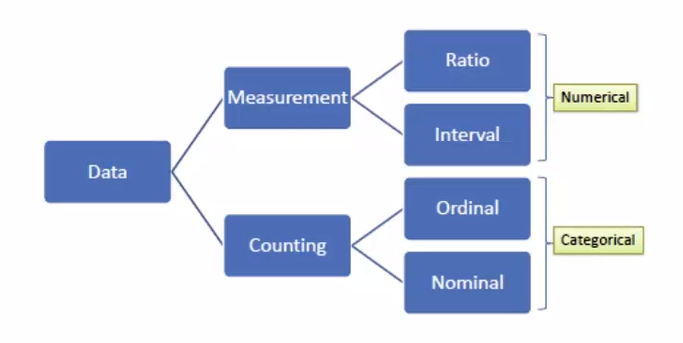
  • Data: Values of qualitative or quantitative variables belonging to a set of items.
  • Data are typically the results of measurements and can be visualised using graphs or images.
  • Data alone carries no meaning. Data must be interpreted and take on a meaning before it becomes information.
  • Data Visualisation: The visualisation of data. Viewed by many disciplines as a modern equivalent of visual communication. Involves the creation and study of the visual representation of data.

[Data visualisation is] information that has been abstracted in some schematic form, including attributes or variables for the units of information.

Michael Friendly (2008). “Milestones in the history of thematic cartography, statistical graphics, and data visualization.” As cited in DataVis POD01 – What is Data Vis?
  • A primary goal of data visualisation is to communicate information clearly and efficiently using statistical graphics, plots, and information graphics.

What is the difference between information graphics and data visualisation?

  • Not all information visualisations are based on data, but all data visualisations are information visualisations.
  • To be a data visualisation, there should be quantitative values on the axis.
  • Effective visualisation helps users analyse and reason about data and evidence. It makes complex data more accessible, understandable and usable.
  • Bar graphs are arguably the best form of data visualisation if you have two variables to communicate.
  • If you’re looking at data over time, a line graph is the best choice for visualising the data.
  • Bar charts, line graphs and timelines are easy to recognise, read and understand as the audience is familiar with them.