Figures alone aren’t effective for comparing data. Visualising data allows us to see the difference between data in a visual way that would otherwise have less impact as plain text.
Data visualisation allows us to see the patterns in data, and draw conclusions from it.
Design is about solving problems and creating elegant solutions, information design is about solving information problems.
David McCandless talks about his love for beautiful data and finding patterns and connections and shows us some of his graphs that are well refined and show interesting patterns.
Data journalism uses gathered data to tell a story. It combines text with data, and allows it to be interactive. It creates stronger stories and allows the reader to process the data and visually see the facts and numbers of the story, rather than just the written words.
The evolution of data journalism
Some of the first data journalism examples are tables full of raw data.
Later, data journalism started to include visual aspects, using type to represent people or including small portions of maps.
In 1943, a picture graph was included in The Guardian to represent 10% of the military plane and tank production from January to March.
From newspapers, data journalism moved to digital mediums. This allowed for faster creation of data and interactivity in the data.
Data journalism in action
During the London Olympics, The Guardian wanted to create an interactive visualisation that could be constantly updated to show the amount of medals different countries had won, and adjust the numbers to make a more even scale. They also wanted the graph to be interactive so that the audience could sort the graph how they wanted, and could be updated as the Olympics went on and more medals were won.
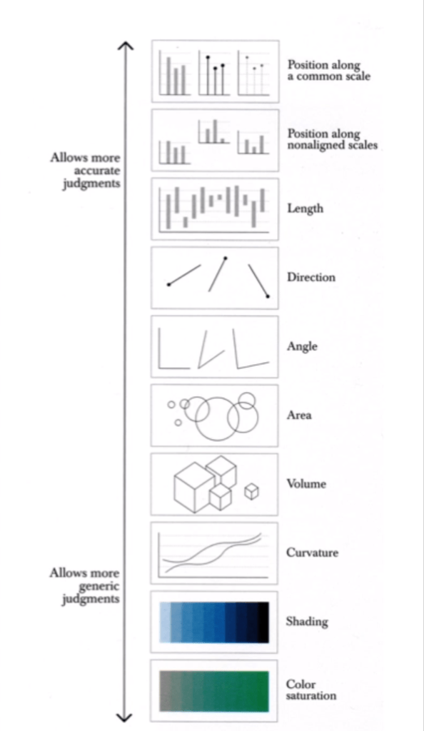
Often designers choose a style of graph that is trendy, rather than the graph best suited to the data you’re trying to present.
The human brain gravitates towards comparing the width or height of shapes in graphs, and its usually easy to underestimate the difference in surface area when looking at a bubble chart for instance. Bar graphs are much easier to draw comparisons from because we only have to consider the length as a variable. Consider which graph type is easiest to analyse and compare differences with.
Using circles in graphs always leads the audience to underestimate the size difference.
Cairo, A. (2013). The Functional Art. Berkeley, California: New Riders.
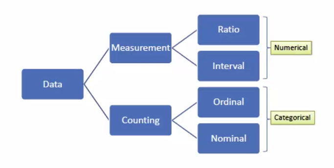
Nominal: Pertaining to names. For example, section of store different items are found in. Usually not ordered, categories. Can be counted and percentages can be found, but you cannot find an average.
Dichotomous: When there are only 2 categories, such as yes or no questions. Eg. Are carrots on sale? The answer can only be yes or no, making it dichotomous.
Ordinal: Ordered. Eg. Scales such as strongly disagree to strongly agree. No mathematical value, but numbers can be assigned to make the data entry easier. Any set of numbers can be used as long as they are in order. Can also calculate percentage.
Interval: Interval between each consecutive point of measurement is equal to each other. Eg. The time between 1pm and 1:30pm is the same as the time between 1:30pm and 2pm. Data is numeric and mathematical operations can be performed on it, but there isn’t a meaningful 0 point. When the value reaches 0 it doesn’t indicate the absence of what is being recorded. Eg. 0am means the start of the day rather than the absence of time. Calendars and temperatures are also interval data.
Ratio: Numeric, and similar to interval data but there is a meaningful 0 point. In ratio data, a measurement of 0 represents the absence of what is being measured. Eg. 0 people waiting in a line. Other examples include weight, height and money.
Determining data types. Waterson. (2016).
Qualitative and Quantitative data
Qualitative data includes descriptive information. It is non-numeric data. Eg. “I drink coffee every day.”
Quantitative data is numeric, and can be quantified. Eg. “I drink 2 coffees every day.” Interval and ratio data are always considered quantitative.