Often designers choose a style of graph that is trendy, rather than the graph best suited to the data you’re trying to present.
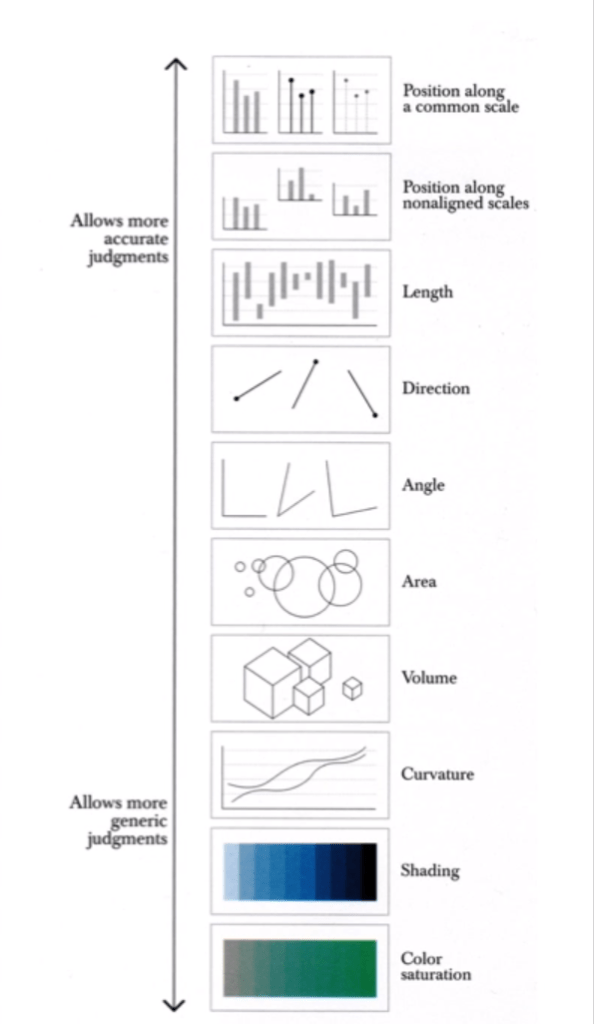
The human brain gravitates towards comparing the width or height of shapes in graphs, and its usually easy to underestimate the difference in surface area when looking at a bubble chart for instance. Bar graphs are much easier to draw comparisons from because we only have to consider the length as a variable. Consider which graph type is easiest to analyse and compare differences with.
Using circles in graphs always leads the audience to underestimate the size difference.
Cairo, A. (2013). The Functional Art. Berkeley, California: New Riders.