Mini Task 3


Do university students conform to gender stereotypes with time spent on activities? This visualisation shows the average hours per day females and males spend on different activities. This data was gathered from 59 university students over the course of one week, where they wrote down activities they participated in every half hour.
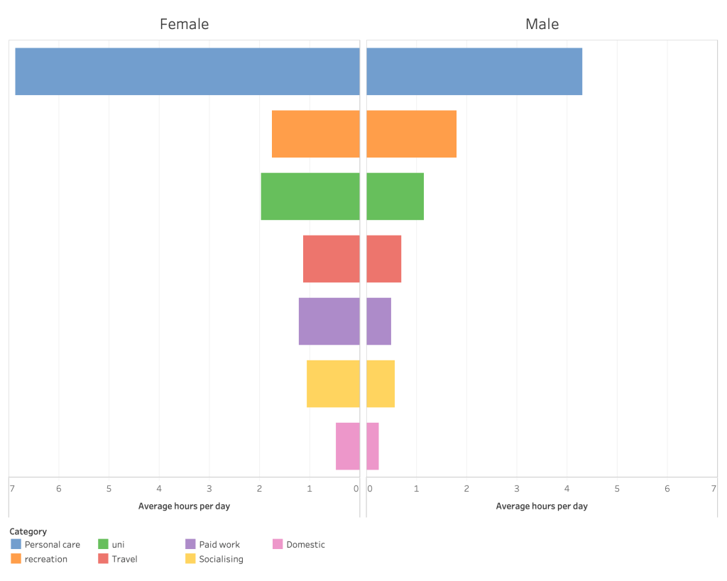
Note: There are more females than males in the sample space, so the results may be inaccurate as a representation of the population.
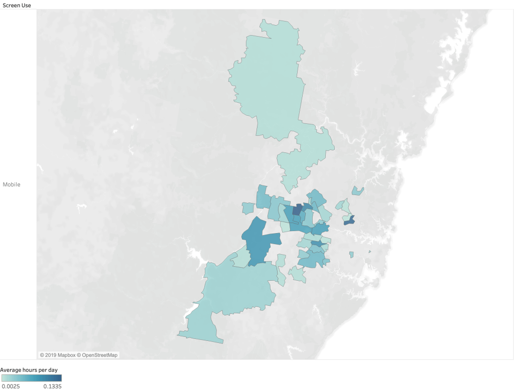
We’re always told to get off our mobile phone, but which suburb uses their phone the most? The following data was gathered over the course of one week by 59 university students, recording their activities every half hour. The heat map was created with Tableau to visualise the areas that recorded the most mobile phone usage.