Flowing Data
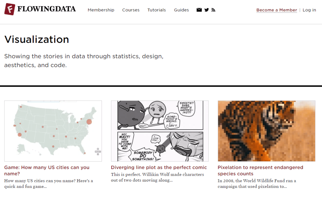
Flowing Data includes many interactive and engaging data visualisations. Many of the visualisations posted are really creative in their design and cover many topics.
DataArt
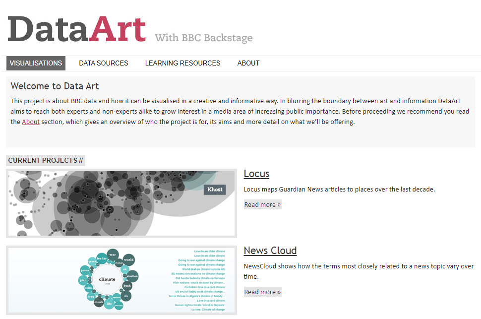
DataArt is a project that uses data from BBC to create beautiful visualisations in creative ways. The visualisations cover current news and world events.
Information is Beautiful
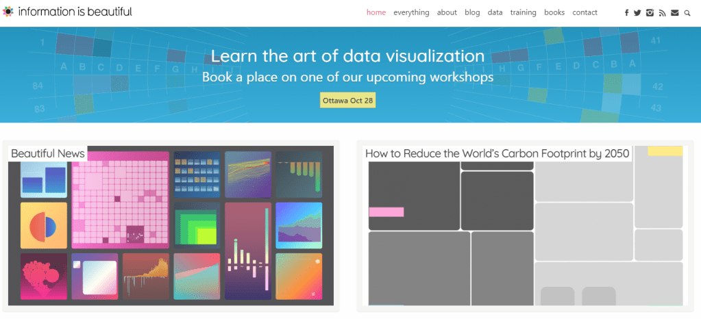
Information is Beautiful shows a collection of data visualisations with unique approaches to design. The colour palettes and styles are particularly inspiring, and are very true to their name.
A Day in the Life of Americans
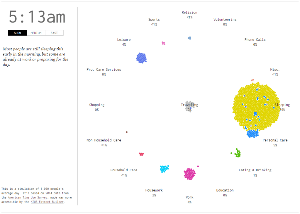
A day in the life of Americans is one visualisation from Flowing Data I particularly found interesting. The visual approach to representing where the population was at a particular time of day has a very pleasing effect, and allows you to easily draw conclusions on what the majority of the population is doing at a particular time.
The Data Visualisation Catalogue
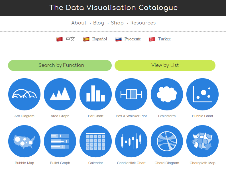
The data visualisation catalogue shows many different ways of visualising data, and gives an explanation of each one. It explains what each graph or chart is good at representing and also covers some potential obstacles when using these methods of visualisation. Examples are also given and guides on how to generate these chart types.